User Interface
With this namespace, you can quickly provide methods to show UI.
The namespace User Interface provides to developers, methods to easily show or validate data.
//accessing to ui methods
SW.UI.{methodName}
editComponentsOptionInBulk
Description
This method can be used to edit an option in various components.
Method(s)
1 function editComponentsOptionInBulk(components: any[], option: string, value: any): void
| Parameter | Type | Required | Defaults | Description |
|---|---|---|---|---|
components | any[] | true | Components array to edit option | |
option | string | true | Option to edit | |
value | any | true | New option value |
Basic Usage
SW.UI.editComponentsOptionInBulk([dataGrid, chart], "dataSource", data);
Response
It will set dataGrid and chart dataSources with the variable data passed.
getEntityImage
Description
This method can be used to get entities image.
Method(s)
1    function getEntityImage(element: HTMLElement, documentName: string,
2       params?: {
3           size?: Size;
            hideName?: boolean;
            title?: string;
4       } = {
5          size: Size.SMALL,
            hideName: false,
            title: null
6       }
7   ): string;
| Parameter | Type | Required | Defaults | Description |
|---|---|---|---|---|
element | HTMLElement | true | HTML element | |
documentName | string | true | Type of document | |
size | Size | false | "small" | Image's size to be displayed(small, medium, large) |
hideName | boolean | false | false | Show or hide the name of the field |
Title | string | false | false | The name displayed in the UI |
Basic Usage
SW.UI.getEntityImage(element, "job", { size: "large" });
Response
Returns the passed HTML element with the entity job image.
setAttribute
Description
This method can be used to set element's attributes.
Method(s)
1    function setAttribute(element: HTMLElement, attribute: string, attributeValue: string,
2       params: {
3           text?: string;
4           createContainer?: boolean
5       } = {
6           createContainer: true
7       }
8   ): HTMLElement
| Parameter | Type | Required | Defaults | Description |
|---|---|---|---|---|
element | HTMLElement | true | HTML element | |
attribute | string | true | Attribute to update | |
attributeValue | string | true | Value to update attribute | |
text | string | false | Inner HTML | |
createContainer | boolean | false | Create a new div container |
Basic Usage
SW.UI.setAttribute(element, "style", "display: contents");
Response
It will add the attribute value to the given attribute.
setConditionalColor
Description
This method can be used to set element's attributes.
Method(s)
1   function setConditionalColor(element: HTMLElement, value: string, conditions: boolean[], colors: string[],
2       params: {
3           createContainer?: boolean;
4           bold?: boolean;
5           italic?: boolean
6       } = {
7           createContainer: true
8       }
9   ): void
| Parameter | Type | Required | Defaults | Description |
|---|---|---|---|---|
element | HTMLElement | true | HTML element | |
value | string | true | Value to show | |
conditions | boolean[] | true | Conditions to check | |
colors | string[] | true | Colors for conditions | |
createContainer | boolean | false | true | Create a new div container |
bold | boolean | false | Bold font | |
italic | boolean | false | Italic font |
Basic Usage
SW.UI.setConditionalColor(element, 'Value', [1>0, 1=0, 1<0], ['Red', 'Green', 'Blue']);
Response
It will add the value text to the element with the background color corresponding to the condition that is true.
setRag
Description
This method allows you to set an element as Red, Ambar or Green according to its value.
Method(s)
1   function setRag(element: any, value: string,
2           red: boolean,
3           ambar: boolean,
4           green: boolean,
5           params: { createContainer?: boolean } = { createContainer: true }
6   ): string;
| Parameter | Type | Required | Defaults | Description |
|---|---|---|---|---|
element | HTMLElement | true | HTML element | |
value | string | true | Value to show | |
red | boolean | true | return the value with background color in red | |
ambar | boolean | true | return the value with the background color in ambar | |
green | boolean | true | return the value with the background color in green | |
createContainer | boolean | false | true | Create a new div container |
Basic Usage
SW.setRAG(e, value, i.value > 15, i.value >= 5 && i.value < 15, i.value < 5);
Response
It will add the value text to the element with the background color corresponding to the condition that is true.
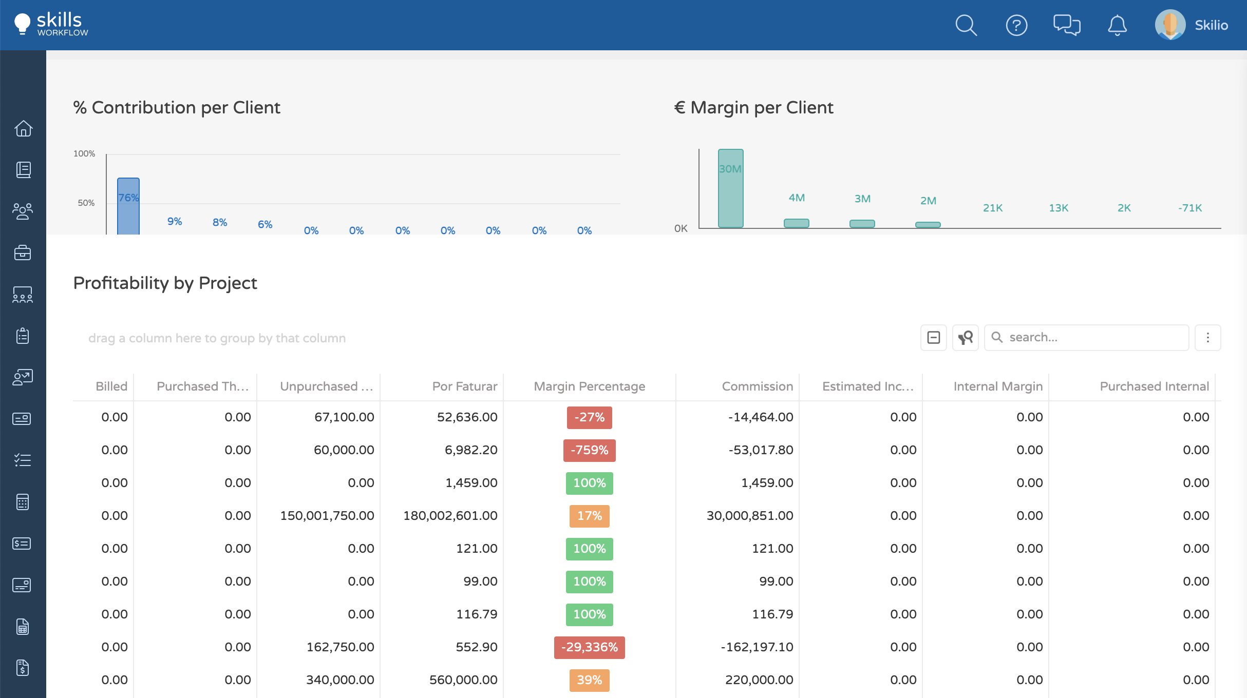
Example
{
    dataField: "MarginPercentage",
    dataType: "number",
    alignment: "center",
    format: "percent",
    width: 120,
    cellTemplate: function(e, i) {
        SW.UI.setRag(e, i.text, i.value < 0.01, i.value >= 0.01 && i.value < 0.99, i.value >= 0.99);
    }
},
setVersionRag
Description
This method can be used to set rag considering two given versions.
Method(s)
1   function setVersionRag(element: HTMLElement, version1: number, version2: number,
2       params: {
3           createContainer?: boolean
4       } = {
5           createContainer: true
6       }
7   ): void
| Parameter | Type | Required | Defaults | Description |
|---|---|---|---|---|
element | HTMLElement | true | HTML element | |
version1 | number | true | Version number | |
version2 | number | true | Version number | |
createContainer | boolean | false | true | Create a new div container |
Basic Usage
SW.UI.setVersionRag(element, 1, 2);
Response
showComponent
Description
This method can be used to create a new component.
Method(s)
1 function showComponent(element: HTMLElement, type: string, properties: object): void;
| Parameter | Type | Required | Defaults | Description |
|---|---|---|---|---|
element | HTMLElement | true | HTML tag | |
type | string | true | Component's type | |
properties | object | true | Component's properties |
Basic Usage
SW.UI.showComponent(element, "List", properties);
Example
In the following example you can find a template for an item that will present a List of items:
function itemTemplate(itemData, itemIndex, itemElement, workspaceContext) {
  var properties = {
    items: [
      { id: 1, value: "Blue" },
      { id: 2, value: "Red" },
    ],
  };
  SW.UI.showComponent(itemElement, "List", properties);
}
showImage
Description
This method can be used to display an existing or default Image.
Method(s)
1   function showImage(element: HTMLElement, documentName: "user" | "client" | "company", name: string,
2       params: {
3           hasImage?: boolean;
4           size?: Size;
5           id?: string;
6           showName: boolean
7       } = {
8           hasImage: false,
9           size: Size.SMALL,
10          showName: false
11      }
12   ): HTMLElement
| Parameter | Type | Required | Defaults | Description |
|---|---|---|---|---|
element | HTMLElement | true | HTML element | |
documentName | string | true | Document type ("user", "client", "company") | |
name | string | true | Document name | |
hasImage | boolean | false | A flag to specify if target already has an image | |
size | Size | false | Image size | |
id | string | false | Document id | |
showName | boolean | false | Show document name |
Basic Usage
SW.UI.showImage(element, "company", "Skills Workflow", {
  hasImage: true,
  id: "companyId",
});
Response
showImageEditor
Description
This method can be used to update a user, client or company image.
Method(s)
1    function showImageEditor(element: HTMLElement, documentName: "user" | "client" | "company", documentId: string,
2       params: {
3           endpoint?: string;
4           size?: Size;
5           width?: number;
6           height?: number;
7           imageStyle?: string;
8       } = {
9           size: Size.LARGE,
10          width: 100,
11          height: 100
12      }
13  ): HTMLElement
| Parameter | Type | Required | Defaults | Description |
|---|---|---|---|---|
element | HTMLElement | true | HTML element | |
documentName | string | true | Image from document user, client or company | |
documentId | string | true | Document id | |
endpoint | string | false | Image's endpoint | |
size | Size | false | large | Image's size to be displayed(small, medium, large) |
width | number | false | 100 | Container width in pixels |
height | number | false | 100 | Container height in pixels |
imageStyle | string | false | Setting height & width in string format |
Basic Usage
SW.UI.showImageEditor(element, "company", "companyId");
Response
It will add the document image with an event listener 'change' to change it.
showPriority
Description
This method can be used to define an element priority.
Method(s)
1 function showPriority(element: HTMLElement, priorityValue: number): void;
| Parameter | Type | Required | Defaults | Description |
|---|---|---|---|---|
element | HTMLElement | true | HTML element | |
priorityValue | number | false | Define element's priority |
Basic Usage
SW.UI.showPrioruty(element, 1);
Response
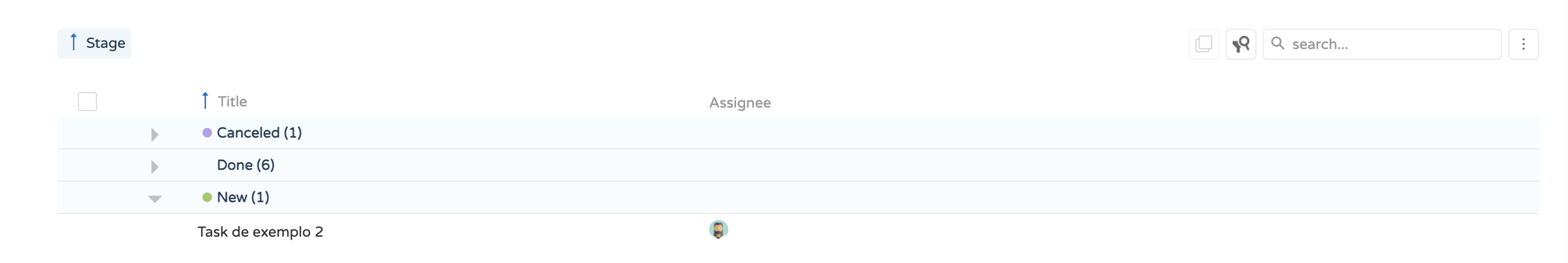
showStage
Description
This method can be used to display a stage.
Method(s)
1   function showStage(element: HTMLElement, name: string, color: string,
2       params: {
3           grouping?: boolean;
4           groupCount?: number
5       } = {}
6   ): void
| Parameter | Type | Required | Defaults | Description |
|---|---|---|---|---|
element | HTMLElement | true | HTML element | |
name | string | false | Stage name | |
color | string | false | Element's color | |
grouping | boolean | false | A flag to define if target is grouped | |
groupCount | number | false | Set the number of elements to group |
Basic Usage
SW.UI.showStage(element, "Test", "blue");
Response
showTags
Description
This method can be used to display tags.
Method(s)
1 function showTags(element: HTMLElement, tags: string = null): void;
| Parameter | Type | Required | Defaults | Description |
|---|---|---|---|---|
element | HTMLElement | true | HTML element | |
tags | string | false | Tags to show |
Basic Usage
SW.UI.showTags(element, "{Label: Skills, Color: #333}");
Response
showTeam
Description
This method can be used to display teams.
Method(s)
1   function showTeam(
2       element: HTMLElement,
3       data: any,
4       idsFieldName: string,
5       namesFieldName: string,
6       hasImageFieldName: string,
7       params: {
8           size?: Size
9       } = {
10          size: Size.SMALL
11      }
12  ): void
| Parameter | Type | Required | Defaults | Description |
|---|---|---|---|---|
element | HTMLElement | true | HTML element | |
data | any | true | A set of data | |
idsFieldName | string | true | Users identifier | |
namesFieldName | string | true | Users name | |
hasImageFieldName | string | true | Flag if executers have images | |
size | Size | false | small | Image's size |
Basic Usage
SW.UI.showTeam(element, data, "UserIds", "UserNames", "UserHasImages", {
  size: "large",
});
Response
This method will add the user images to the given element..
Example
{
        dataField: "ExecutorNames",
        caption: "Assignee",
        dataType: "string",
        allowEditing: false,
        visible: true,
        cellTemplate: function cellTemplate(e, i) {
            if (i.data && i.data.ExecutorNames) {
                SW.UI.showTeam(e, i, 'ExecutorIds', 'ExecutorNames', 'ExecutorHasImages', { size: 'small' })
             }
        }
},
showWorkload
Description
This method can be used to display assignments workload.
Method(s)
1 function showWorkload(element: string | HTMLElement, assignmentId: string): Promise<void>
| Parameter | Type | Required | Defaults | Description |
|---|---|---|---|---|
element | string | HTMLElement | true | HTML element or string | |
assignmentId | string | true | Assignment id |
Basic Usage
SW.UI.showWorkload(element, "assignmentId");